
Opportunity
The Association Typographique Internationale (ATypI) is a nonprofit organization dedicated to advancing typography and the field of type design. For this conference proposal, the challenge was to create a compelling host city identity that reflected both Seoul's cultural character and the conference's mission of fostering dialogue, innovation, and exploration within type design.
Goal
As the brand designer, I developed the conference theme, visual identity, and application system. My goal was to create a concept that felt uniquely tied to Seoul while celebrating the creative possibilities of typography, and encourage attendees to look beyond what type says and explore what it can show.
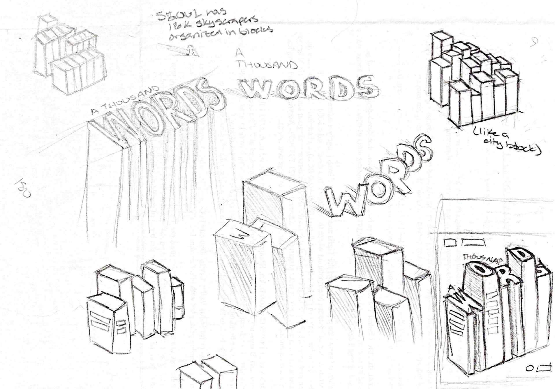
Sketching on Paper: Before opening any design software, I sketch with pencil and paper to freely explore ideas, letting concepts take shape before refining them digitally.
Process
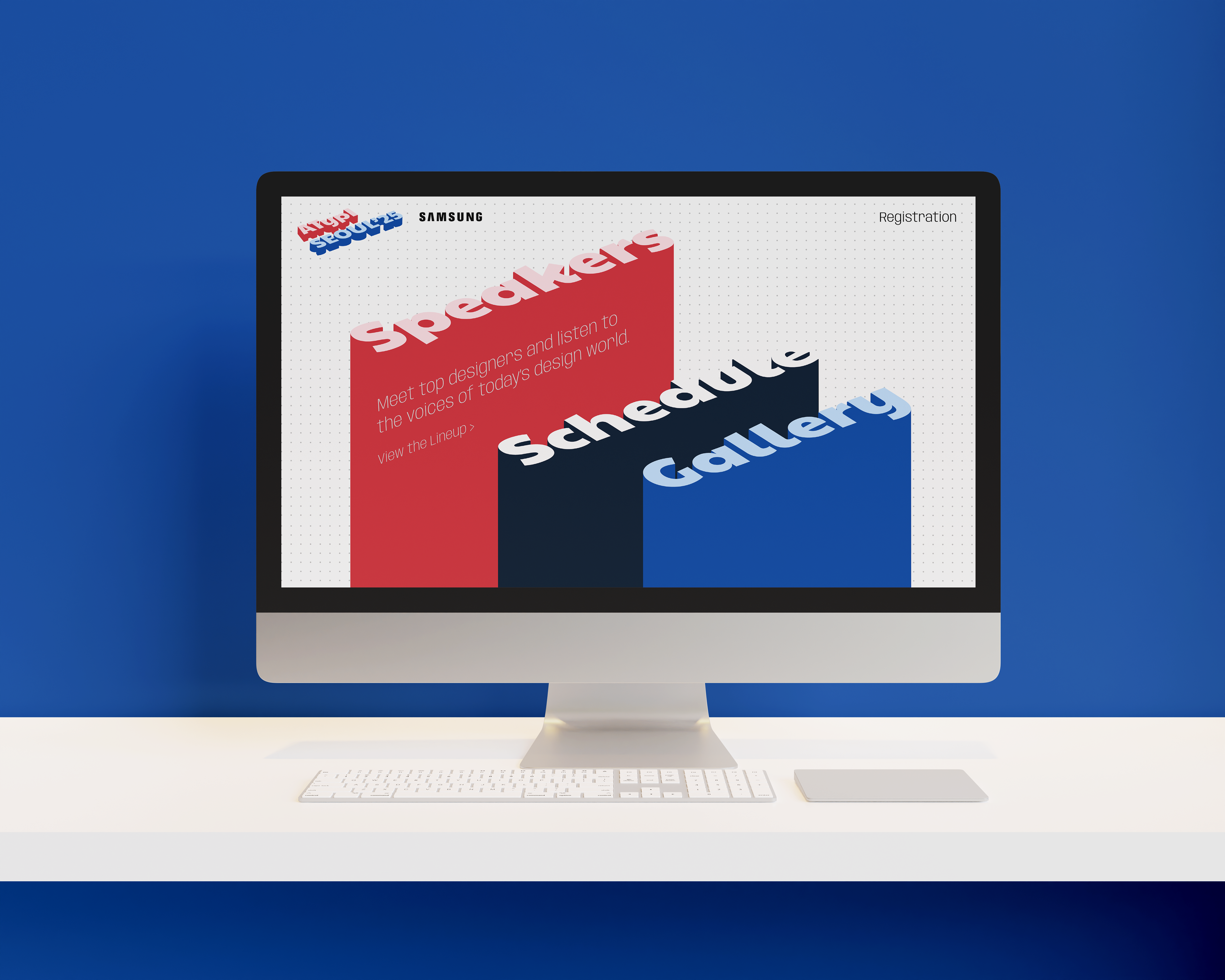
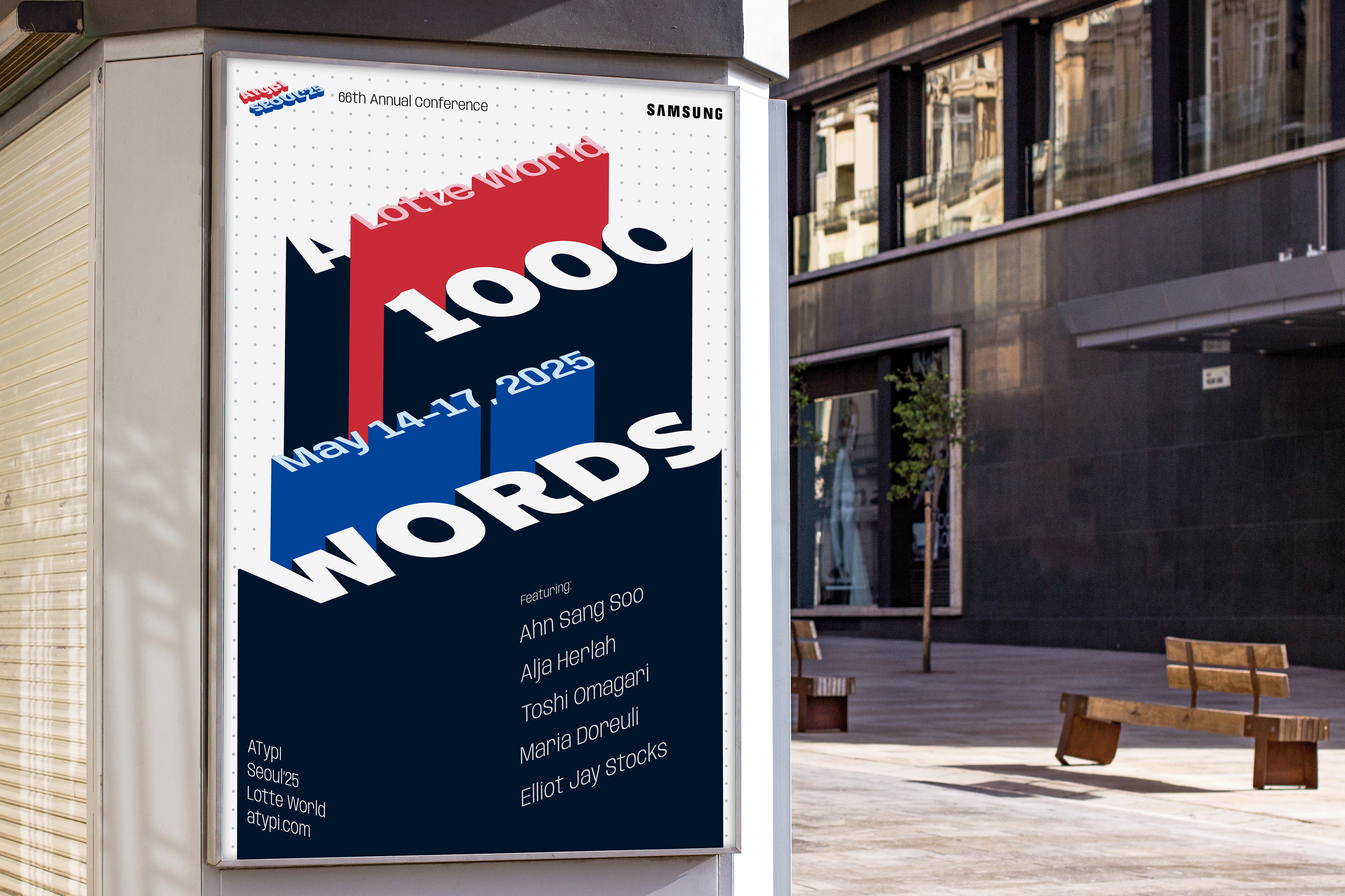
I immersed myself in Seoul's culture, architecture, and typographic history, looking for ways to connect the city's identity with the conference experience. Inspired by the pictorial qualities of Hangul, I experimented with transforming letterforms into imagery, using type to construct an abstracted Seoul skyline that became the foundation of the visual system.
Outcome
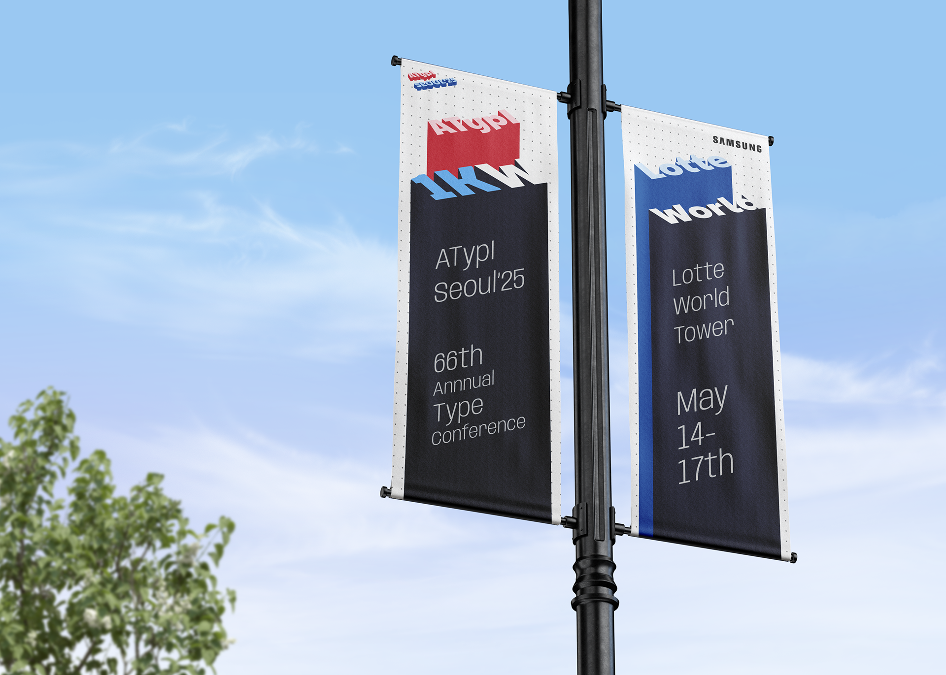
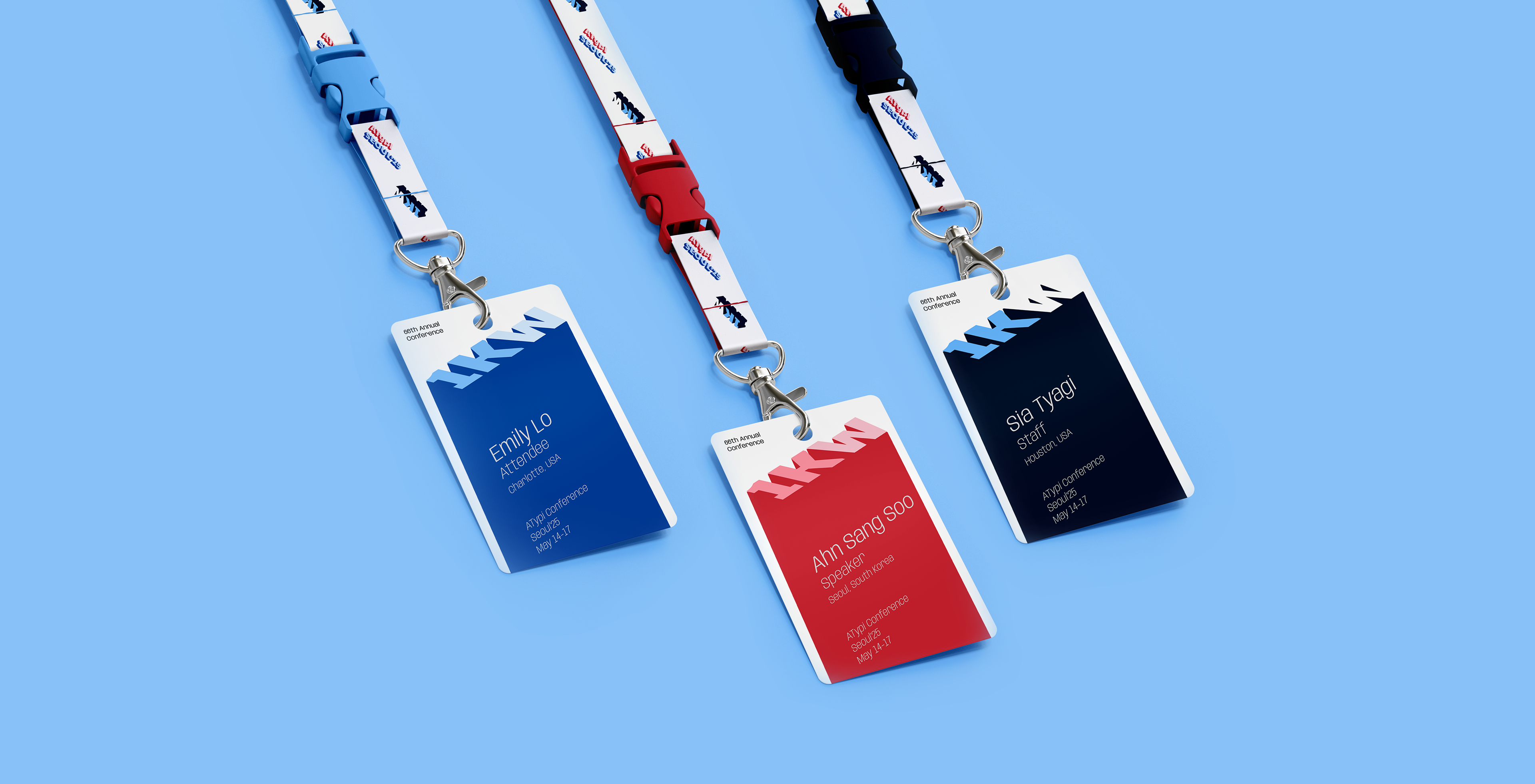
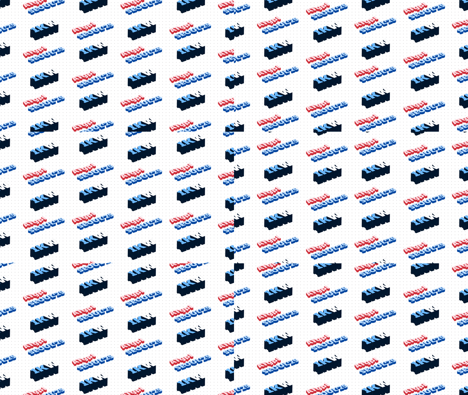
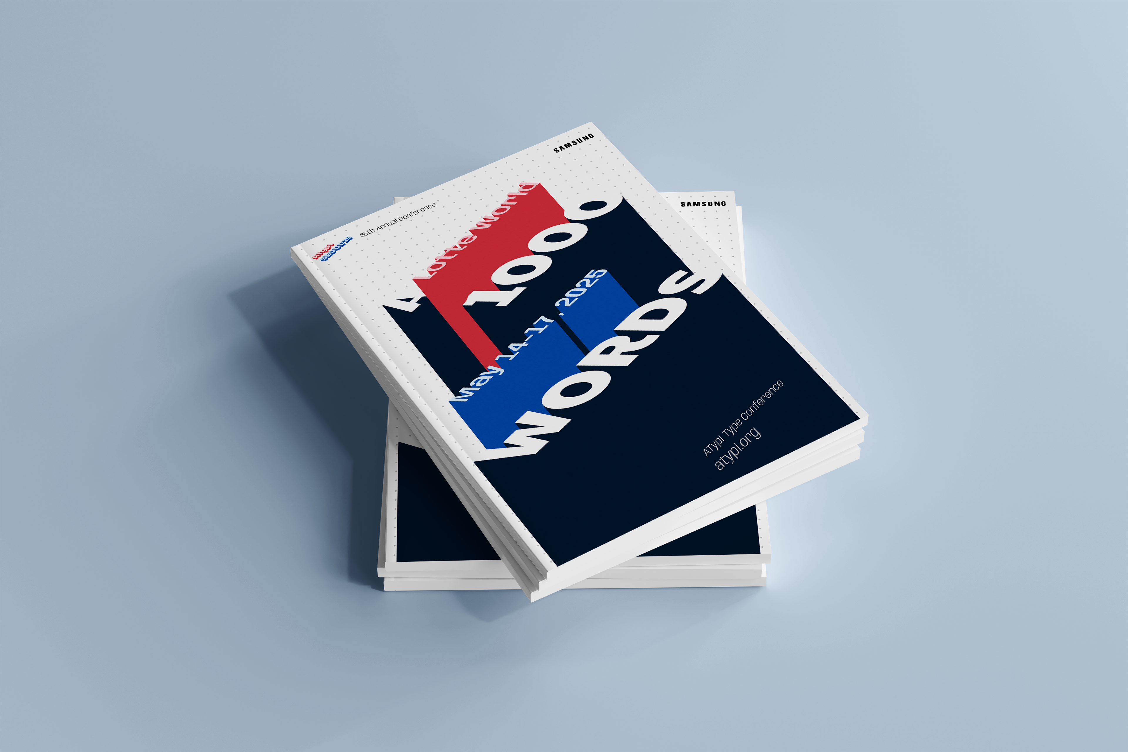
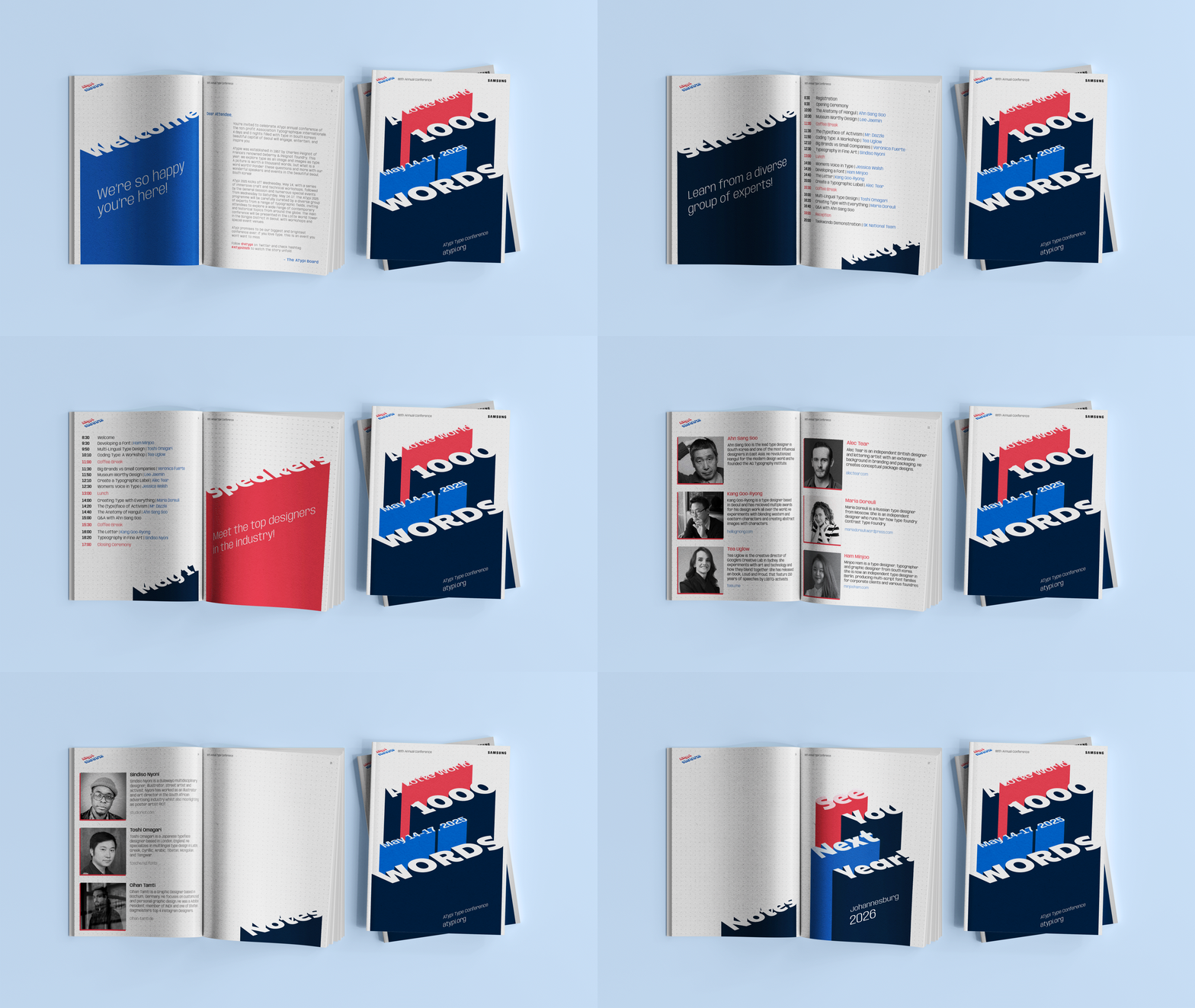
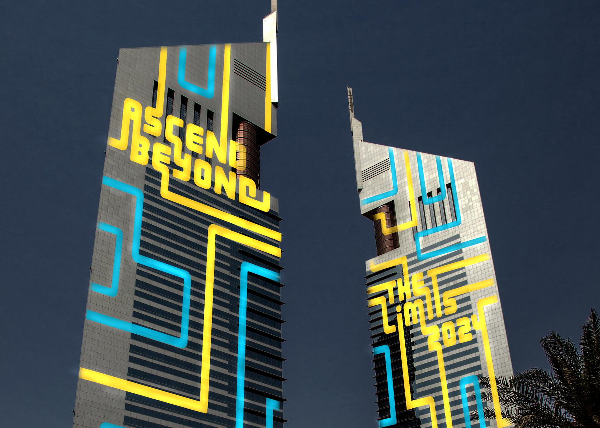
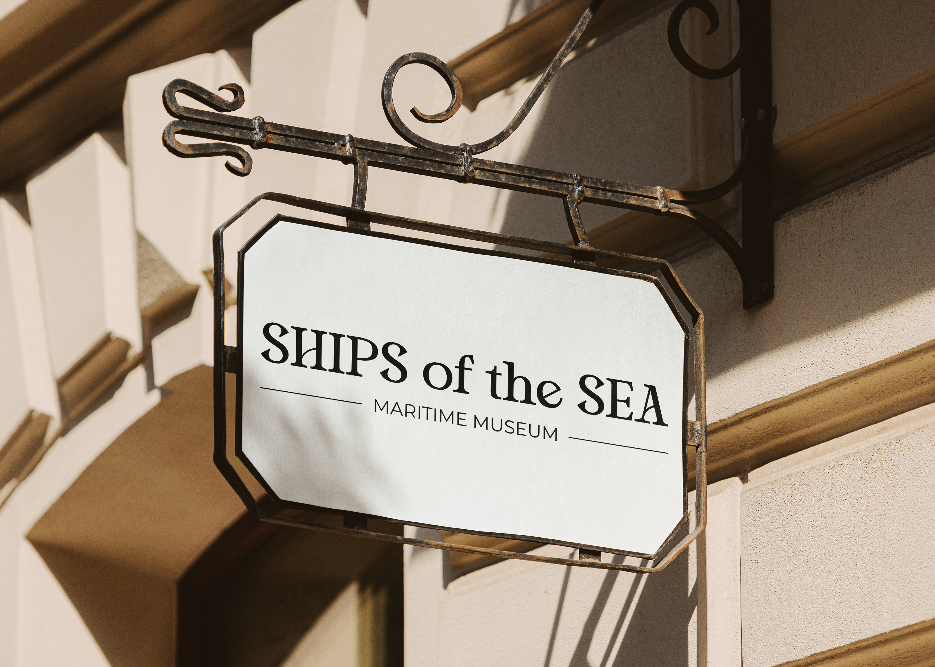
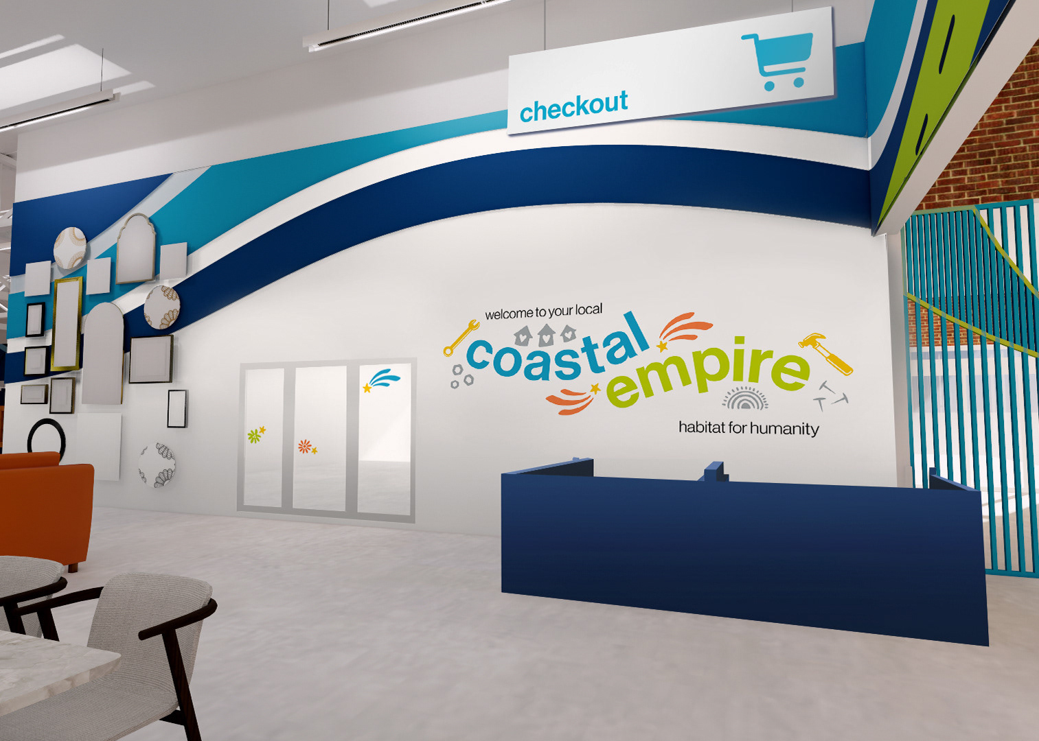
The final identity transforms typography into both a communication tool and a visual experience, blurring the line between reading and seeing. Applied across posters, wayfinding, digital assets, and merchandise, the system creates a cohesive conference experience that celebrates Seoul's typographic heritage while inviting attendees to rethink the relationship between words and images.